
Here's an analysis of Game of Thrones data to identify character importance, factions, and gender interactions using Network Theory and Python.
At a high level, Network Theory is the study of relationships between objects, more specifically it is a subfield of Graph Theory with extra attributes attached to the nodes and edges. If you’re confused by these terms, don’t worry I’ll explain everything in a bit. For the rest, you might be familiar with graph theory and have not-so-fond memories associated with it but bear with me for a while. I first learned basic graph theory in my university’s algorithms course and, I’ll be honest, I found absolutely nothing of interest in the entire topic.
Sure, I could find the shortest path between two cities or find the best way to lay down routers in a computer network, but these topics never seemed fun to me. That is until I started exploring data science and joined a Data Science Bootcamp where I learned about a lot of things related to data including network analysis. That really opened my eyes to what the graph theory concepts were capable of. I encourage you to check out
I will go about my exploration using two separate but related lines. The first will be a theoretical overview of each topic, and the second will be some implementation to see the concepts in action.
What is network theory?
Let's get some basic definitions out of the way so everyone is on the same page and we can get to the fun bits.Network Theory is the study of objects and their relationships with each other. This setup is often represented as a Graph which is just a collection of nodes and edges. Nodes are the individual objects in a network and Edges are the links representing the relationships between nodes.
Undirected, directed, and weighted graphs
I want to clarify something right in the beginning, a graph is one model of a given situation or system, but that does not mean that the graph is the only model. What a node or edge represents is your choice (or informed by the data). In this case, I can determine that each node is a person and an edge between them means that they are friends with each other. This is called an Undirected Graph.Now consider the same situation but I tell you that it is possible for a person to be friends with someone who’s not friends with them, a one-sided friendship. This changes the situation, and we need a different (more informative) model to represent it. Enter Directed Graphs:
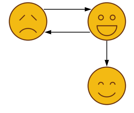
Getting our feet wet
I will be using Python to implement the algorithms since I'm more comfortable with it and while learning a new topic I don't want to be bogged down by language specifics.Starting with the data, it is available on Andrew Beveridge’s GitHub. He (in his own words) does maths for fun, which I feel is a very appropriate mindset for me too. The data contains records of character interactions for all seasons (up to 7). I am only using the latest season’s data but I encourage you to explore the temporal information in the dataset. You could even create animations to show how the data has changed over time.
Let’s discuss the packages I will be using briefly. Numpy, pandas, matplotlib (and seaborn) are the usual companions in any Data Science project. I also use the defaultdict data structure here.
The interesting stuff is in the last three lines. I will be using networks for the general purpose of graph handling, nxviz to do the heavy-lifting visualization tasks, and the community package used for one particular algorithm.
import numpy as np
import pandas as pd
import matplotlib.pyplot as plt
%matplotlib inline
import seaborn as sns
from collections import defaultdict
import networkx as nx
import nxviz as nxv
import community
A brief note about loading a graph dataset before we continue our exploration further. You might be familiar with common data formats like CSV or JSON which can be loaded as a data frame object using the pandas library. Graphs are a bit different in this regard since they’re usually saved as 2 separate files (one each for nodes and edges) which need to be loaded and combined into a graph object manually. The object is provided by the networkx library but the exact mechanics of constructing the graph will be different for each dataset. I’ve added my code here for you to see.
def make_graph(nodes_df, edges_df):
    g = nx.Graph()

    for i,row in nodes.iterrows():
        keys = row.index.tolist()
        values = row.values
        # The dict contains all attributes
        g.add_node(row['Id'], **dict(zip(keys,values)))

    for i,row in edges.iterrows():
        keys = row.index.tolist()
        values = row.values
        g.add_edge(row['Source'], row['Target'],
                   **dict(zip(keys,values)))

    return g

nodes = pd.read_csv('data/got-s7-nodes_merged.csv', index_col=0)
edges = pd.read_csv('data/got-s7-edges-filtered.csv')
g = make_graph(nodes, edges)
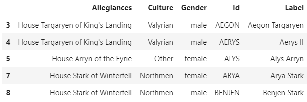 Each row describes a single character of the data
nx.draw(g, with_labels=True)
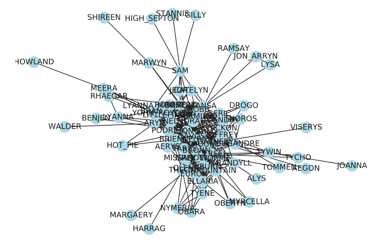 Node link diagram representing a bigger network
pos argument of the nx.draw function, but it is too much work to manually figure out the best arrangement.
Can we do better? Yes, we can. Let’s make a Circos Plot using a very simple library called nxviz. If you’ve ever used seaborn for making plots, this is very similar to working with.

c = nxv.CircosPlot(g, node_color='Gender', node_grouping='Gender', edge_width=(edges['Weight'] / edges['Weight'].quantile(0.97)).tolist(), node_labels=True, node_label_layout='rotation', group_label_position="middle", group_label_offset=12, figsize=(8,8))
c.draw()
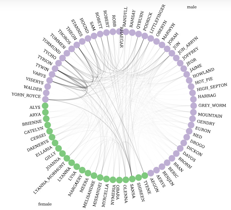 Circos Plot with a very simple library called nxviz
Which gender has more interactions?
Let's try to explore this data further. I want to see how males and females interact with each other. For this, we can create a transformed version of our original graph. Which kind of graph would be most suitable to represent this information? We know we have two genders, and we want to model relationships between them. This means we have two nodes. We have four possible kinds of interactions:- female -> female
- male -> male
- female -> male
- male -> female
The weights will be the sum of all interactions in the data for that pair. This means the weight of the female -> female edge will be the sum of weights for all edges in the original graph where the people on both ends were female.
I’ll introduce another useful graph concept here, the adjacency list. For a graph with nn nodes, this is an n×nn×n matrix where the entry at index (u,v)(u,v) contains the weight for the edge between nodes uu and vv. For an unweighted graph, this is a binary matrix, just containing 1 and 0, and is symmetric for undirected graphs (think about why this is).
I’ll plot this matrix as a heatmap and normalize the values because there are overall more males in the show’s cast.
counter = defaultdict(int)
for frm, to in g.edges:
    link_type = g.nodes[frm]['Gender'],g.nodes[to]['Gender']
    counter[link_type] += g.edges[(frm,to)]['Weight']

sg = nx.DiGraph()
for (frm,to),w in counter.items():
    sg.add_edge(frm, to, weight=w)
sg.edges[('male', 'female')]

m = nx.to_numpy_matrix(sg, nodelist=sg.nodes)
sns.heatmap(m/m.sum(), annot=True,
            xticklabels=list(sg.nodes), yticklabels=list(sg.nodes));
plt.gca().set_aspect('equal')
Nevertheless, this result can be explained by the fact that the show is based in a Medieval setting of Kings, Lords, and Knights - all of whom used to be males. So, the results we have obtained make sense in the context of the show.
Which character is most important?
Now I want to find out who the most important characters are in the show. The condition for there being an edge between two nodes is that the two characters must have interacted, and the weight of the edge represents the number of interactions. It is reasonable to say that more important characters will have more interactions with various characters overall.Intuitively, the more the weights of edges connected to a given node, the higher the node’s importance. So, to represent importance I can sum the weights of all edges a node has. This is called the Degree Centrality of the node, formally defined as the number of edges that are incident upon a node (for an undirected graph this is the same as the outgoing nodes). There are other measures of Centrality defined in graph theory, each is useful to identify different characteristics of a network.
Let’s look at the trend of degree centrality measured in our data.
deg_cen = nx.degree_centrality(g)
nodes['deg_cen'] = nodes['Id'].apply(lambda x: deg_cen[x])
g = make_graph(nodes, edges)

fig, ax = plt.subplots(figsize=(20,8))
sns.barplot(data=nodes.nlargest(50, 'deg_cen'),
            x='Id', y='deg_cen', hue='Gender',
            ax=ax);
ax.set_xticklabels(ax.get_xticklabels(), rotation=90);
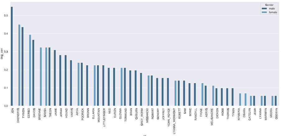 The trend of degree centrality measured in our data
a = nxv.ArcPlot(g, node_color='Gender', node_grouping='Gender',
                node_size=[10*g.nodes[n]['deg_cen'] for n in g.nodes],
                edge_width=(edges['Weight'] / edges['Weight'].quantile(.95)).tolist(),
                figsize=(10,10))
a.draw()
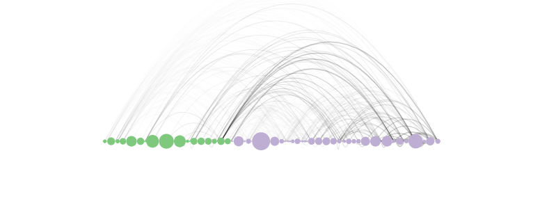
Which characters are in the same faction?
If you've seen or even heard about the show, you know that it features some serious political rivalries and factions. Is there a way to visualize these alliances? Can we draw some lines on a graph to indicate these alliances? Drawing these lines is known as Graph Partitioning.Finding Graph Partitions is a very common task in graph theory. One very simple algorithm to achieve this is the min-cut method. A cut is a partition of the nodes of a graph into 2 disjoint sets. The weight of this cut (for weighted graphs only) is the sum of weights of all edges which cross the cut. This means that there will always be some cut of a graph that has the minimum weight.
So, the problem of finding the two factions in Game of Thrones now becomes a problem of finding the min-cut of the graph. We can extend this into a k-cut problem to find an arbitrary number of partitions.
While I will not be using the min-cut method to find partitions, I find the graph cut definition to be the most intuitive explanation for the process. The reason I use a different method is that the min-cut method does not generate good partitions for the Game of Thrones dataset.
The implementation I use comes from the community package in Python.
cmt = community.best_partition(g, weight='Weight')
nodes['cmt'] = [v for c,v in cmt.items()]
g = make_graph(nodes, edges)

c = nxv.CircosPlot(g, node_color='cmt', node_grouping='cmt',
                   node_labels=True, node_label_layout='rotation',
                   edge_width=(edges['Weight'] / edges['Weight'].quantile(0.98)).tolist(),
                   figsize=(8,8))
c.draw()
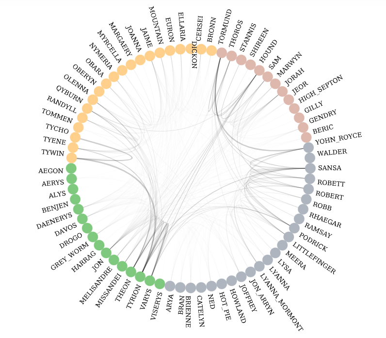 4 communities identified in Circos plot
Since we have split the graph into 4 partitions, maybe looking at the node-link diagrams for each partition separately isn’t such a bad idea anymore.
pos = nx.spring_layout(g)  # compute graph layout
for cmt_num in np.unique([v for c,v in cmt.items()]):
    partition = community.best_partition(g)

    nodelist = []
    # one community against the others
    for node, c in partition.items():
        if c == cmt_num:
            nodelist.append(node)
        else:
            partition[node] = -1  # put all the other communities in one communitiy

    sg = g.subgraph(nodelist)
    edge_widths = [sg.edges[e]['Weight'] for e in sg.edges]
    edge_widths = [w/np.quantile(edge_widths, 0.9) for w in edge_widths]

    fig, ax = plt.subplots(figsize=(15,10))
    nx.draw(sg, pos, with_labels=True, width=edge_widths)
    ax.set_title(f'Community {cmt_num}');
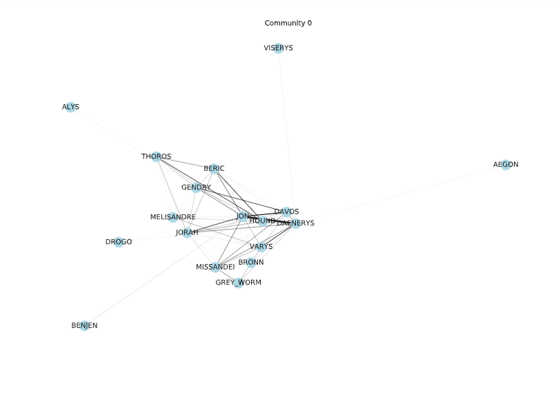 Node-link diagram of Community 0
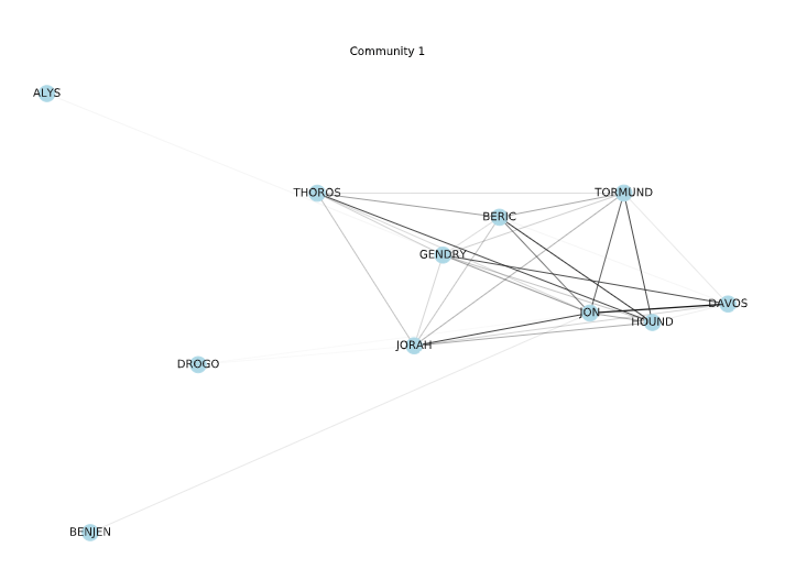 Node-link diagram of Community 1
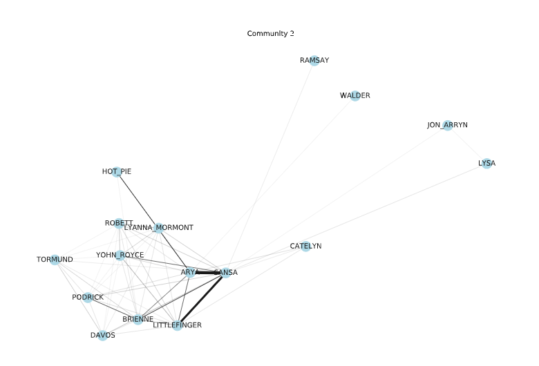 Node-link diagram of Community 2
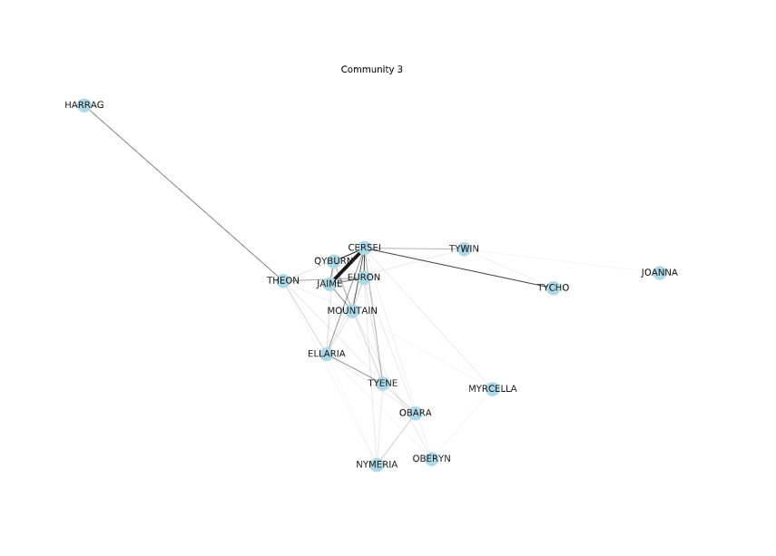 Node-link diagram of Community 3
Like I said in the beginning, I just wanted to learn more about network analysis and share my exploration with you, and I think I succeeded in doing that. Do not consider the analysis or insights from this blog to be any kind of prediction. If you have some knowledge about the show, then you might have noticed that there were a few results that don’t exactly match the show’s storyline. A more thorough analysis is required to make any form of claims based on the data.
One of my inspirations to learn network analysis was a SciPy 2018 talk by Eric Ma and Mridul Seth, titles
I hope this blog has helped you learn some fundamental concepts of Network Theory. I am hoping you will use network theory in a project soon!
Want to build AI agents that can reason, plan, and execute autonomously?
Learn more